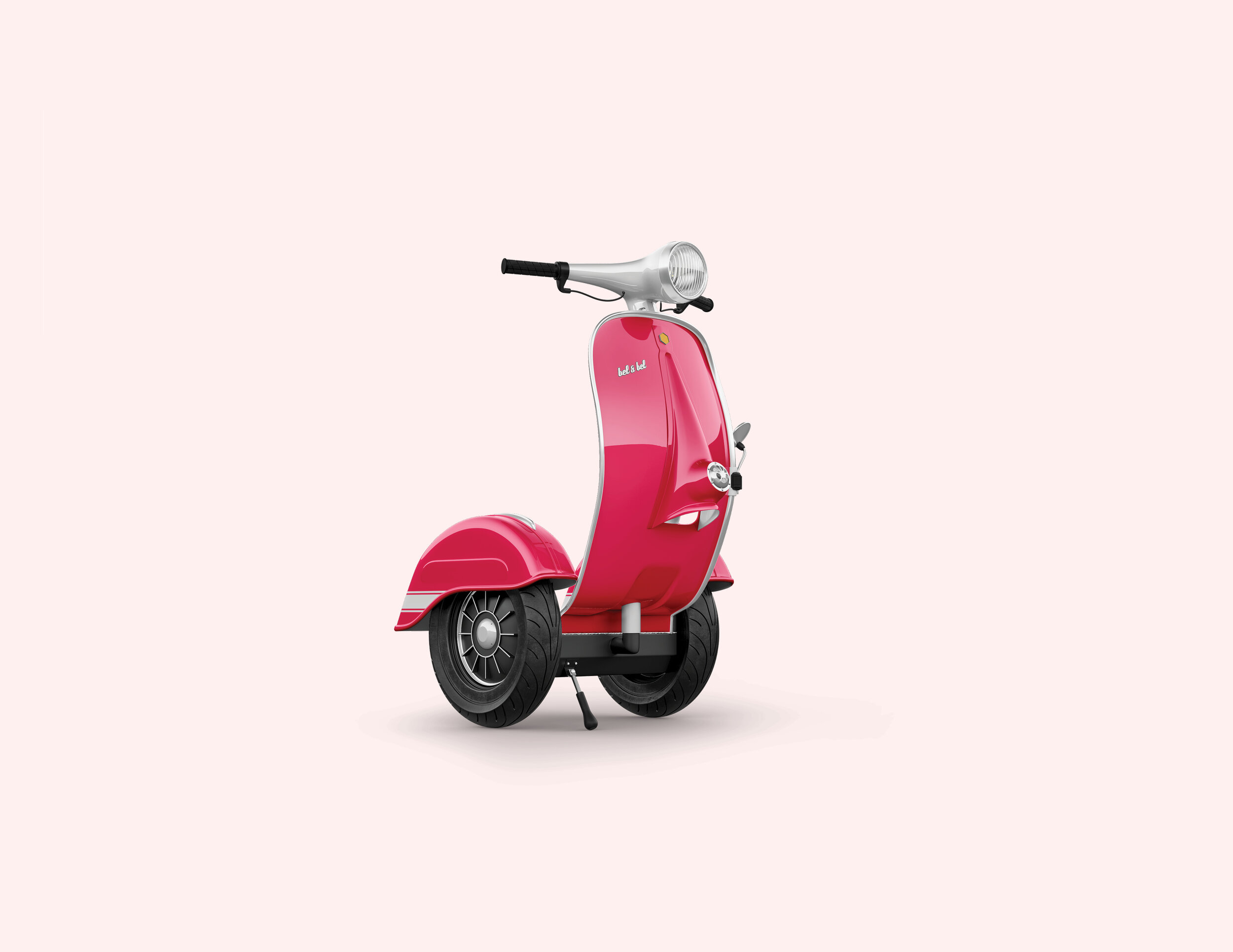
Electric Scooters Breeze
Brand Strategy + Brand Identity
“At Breeze, we believe that having fun should not only be a destination but a path.”
This branding project focuses on Breeze’s brand strategy and visual identity. Polishing Breeze’s vision and core values, I wanted to bring out the scooter’s most quintessential relationship with the user—the ride experience—rather than its functional traits alone.
Beyond enabling people to commute or physically move from point "A" to point "B", Breeze provides a safe and intuitive drive that stirs fun into the equation as their key differentiating factor and at every step of the experience.
Our Vision
We want to give people a “ride out of the box”, anywhere and at any time.
The experience of commuting is usually dispassionate and, in a way, totalitarian. Breeze aims for the democratization of this experience, making it personal, unique and accessible.
Offering a way out of the conventionalities of transportation, Breeze seeks to connect with the driver emotionally while giving them a platform to ride out of monotony.
Visual Identity
Color Palette
The color palette, predominantly monochromatic, sprouts from the Crimson Magenta, Breeze’s primary color. The overall palette aims to be vibrant, alive and a symbol of empowerment, choosing color magenta as a symbol of democracy, a color for all.
Logo
The logo mark coexists & is born within an isometric grid composed of triangles. This geometric shape mimics Breeze’s heart & most differentiating sound, the double “e”, which is ultimately rounded at the corners for a friendlier appeal.
Iconography
Following the symbol’s visual rules, the iconography is obtained from the same isometric grid in order to provide a strong & consistent visual language.
Typography
The coexistence of a sans-serif and a display serif wants to open a conversation about inclusivity. In this way, the two typographies suggest consonance out of contrast.

“Paving a brand new road.”
— Breeze
Editorial
Brochure
Breeze is all about the road, about the ride, about the experience. In this way, the user journey involved in reading a piece of editorial seeks to be dynamic, fun & intuitive.
Digital Applications
Website
The online translation of the aforementioned approach. Digital applications, whether web or mobile, provide dynamism to the user experience and apply motion wherever it is possible to resemble “the ride.”
Headquarters
Within Breeze’s headquarters, employees, visitors and staff are reminded to think out of the box and enjoy the experience unconventionally. With the help of imagery and text, they highlight their claim “Ride out of the box”, & invite people to physically step in and out of magenta boxes printed on some of their floors & walls.


